UX Writing Projects
This section features selected projects from my UX Writing Hub coursework, an international training program for UX writers and content designers.
Each assignment demonstrates how I use conversational language to simplify complexity, highlight product value, and guide users toward adoption.
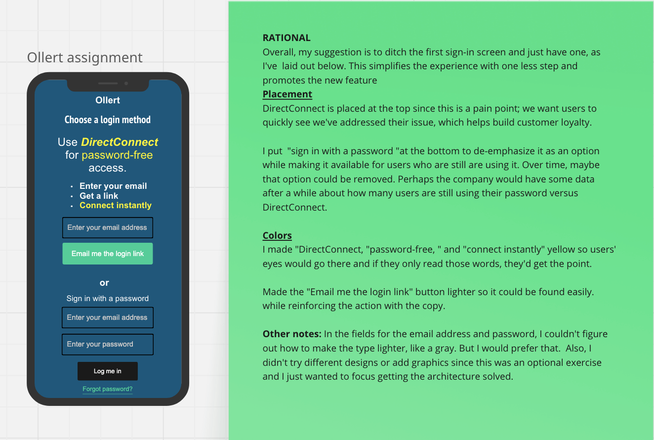
Password-free login
CREATED WITH MIRO
I restructured Ollert’s login screen to spotlight the new password-free feature while keeping the familiar password option accessible. The copy emphasizes ease and security, while button placement and color help guide attention naturally toward the preferred login path.
COURSE ASSIGNMENT DETAILS
Challenge: Redesign the login flow for Ollert, a project management app, to introduce a new passwordless sign-in option while keeping the existing password method available.
Context: Users were frustrated with remembering multiple passwords across workspaces, so the team wanted to add an email link login as a simpler, more secure alternative.
Task: Rewrite and redesign the login screen to present both options clearly, improve on overly casual copy, and highlight passwordless login as a trusted new feature — all within a mobile-friendly design
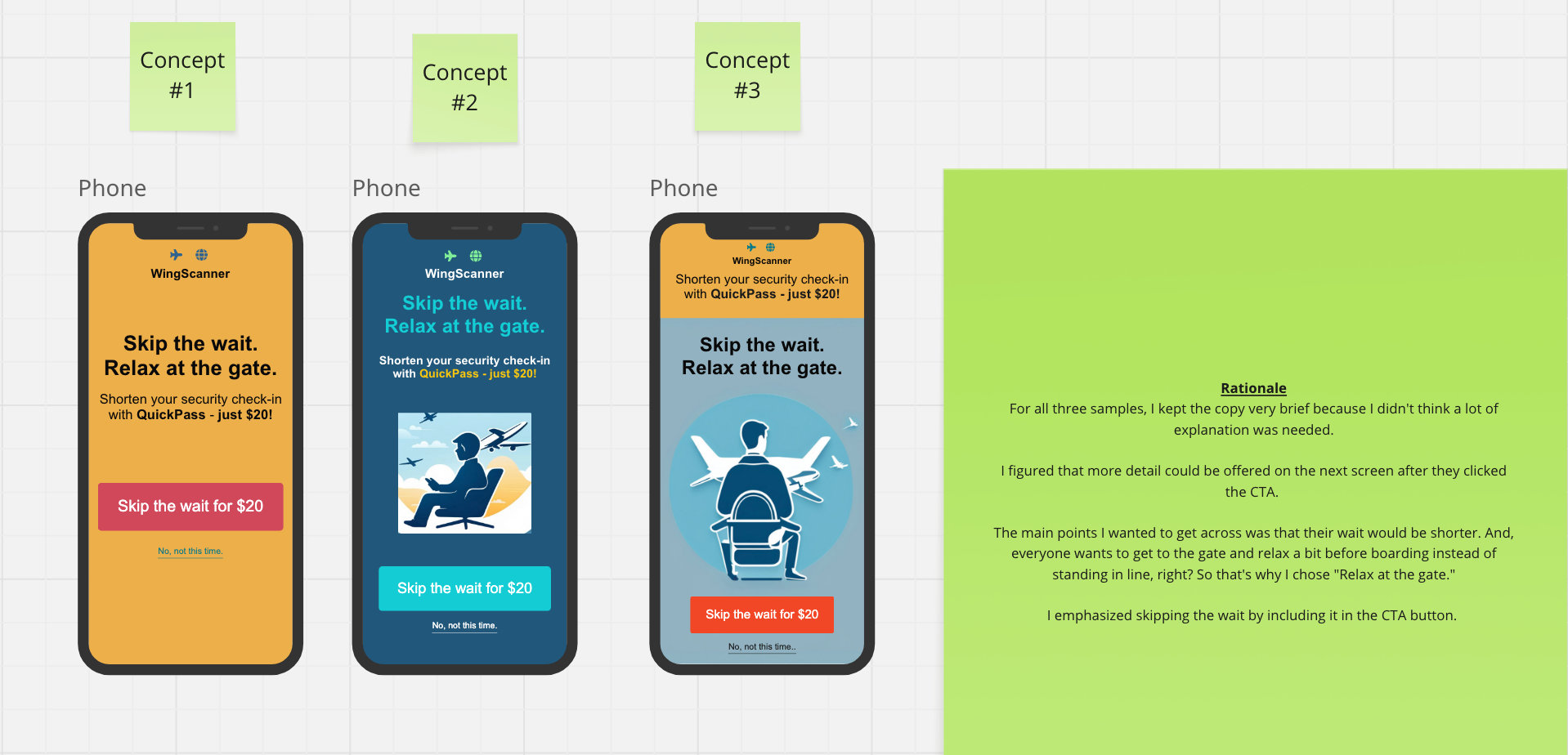
New feature promotion
CREATED WITH MIRO
I created the name QuickPass and designed three concepts that highlight the traveler’s top priority: reducing wait time. Each version underscores the benefit of more time at the gate, while the CTA reinforces action with “Skip the wait.”
COURSE ASSIGNMENT DETAILS
Challenge: Create a promotion screen for a new airline feature that lets travelers skip long security lines for an additional $20.
Context: As a low-cost airline, WingScanner wanted to introduce an upsell feature that highlights convenience and reduces friction at a critical stage — just before checkout.
Task: Develop the feature name (QuickPass), refine the screen copy to be concise and benefit-driven, and structure the CTA to encourage adoption while minimizing drop-off risk.
COURSE ASSIGNMENT DETAILS
Challenge: Write microcopy for five scenarios in Lingual,
a language-learning app with a playful, encouraging brand voice.
Task: Decide the best delivery method (toast/snack bar, pop-up, or inline), write the copy, and explain the rationale behind each choice.
Focus: Keep interactions clear, fun, and supportive while guiding users through celebrations, warnings, confirmations, and rewards without breaking their flow.
Scenario 1: Badge unlocked
Message (Toast/snack bar):
🧙♀️Word Wizard badge unlocked! 500 words mastered!
Delivery:
Toast/snack bar at the bottom of the screen immediately after completing a lesson.
Rationale:
Badges celebrate progress. A toast keeps the moment playful and rewarding without interrupting the user’s flow, while the badge also appears later on their profile.
Scenario 2: Exit warning
Message (Pop-up):
Done making word magic for now?
🌟 You can save your progress or let it go and start fresh next time. It’s up to you! ✨
[Save your progress]
[Please delete]
Delivery:
Standard pop-up with headline, subhead, and clear action buttons.
Rationale:
Leaving mid-session risks data loss. A pop-up ensures the warning is noticed, while the playful tone softens the interruption and helps users feel in control.
Scenario 3: Unfollow confirmation
Message (Toast/Snack Bar):
You’ve unfollowed [learner’s name]. Change your mind? [Undo]. 🔄
Delivery:
Toast/snack bar at the bottom of the screen.
Rationale:
Unfollowing is low-stakes and doesn’t warrant a pop-up. A toast quietly confirms the action while offering an easy undo.
Scenario 4: Connection lost
Message (Pop-up):
Connection lost.
Reconnect to resume your journey. Meanwhile, we’ll keep the magic warm for you!
[Reconnect now]
Delivery:
Standard pop-up with an immediate call-to-action.
Rationale:
Connection issues are disruptive, so a pop-up ensures visibility. Using Lingual’s playful voice helps reduce frustration while offering a clear fix.
Scenario 5: Daily goal & reward
Message (Flow Screens):
Great job!
✨ Another magical milestone. ✨
You’ve added [X] new words today and earned 💎10 shiny Ling-gems 💎
[Claim your gems at the LingShop]
[No, I’ll keep learning and visit the LingShop later]
Delivery:
Integrated into the lesson-completion flow with a follow-up LingShop screen for gem selection.
Rationale:
Rewards feel most natural when paired with progress review. Delivering the gems after a lesson reinforces achievement without breaking momentum, while letting users choose when to explore the shop keeps them in control.
Error messages
COURSE ASSIGNMENT DETAILS
Challenge: Write error messages for GuerillaBox, a new platform that centralizes customer communication channels (SMS, email, WhatsApp, Intercom, social messaging, etc.). The goal was to create copy that matched GuerillaBox’s brand voice — plainspoken, genuine, lightly humorous, and supportive.
Task: Create five error messages for the signup flow (invalid email, email already exists, invalid password, invalid username, and username already exists). For each, explain the trigger and provide rationale to show how the copy guides users without sounding technical or harsh.
Focus: Keep messages light, clear, and on-brand while nudging users toward the fix and maintaining a positive, friendly tone.
Invalid email
Message:
Whoops, that email doesn’t look right. Blame it on autocorrect, and try again!
Trigger:
Appears when the email entered doesn’t follow the standard email format.
Rationale:
Rather than saying something generic like “invalid email” or making it the user’s fault, I playfully nudged them to double-check without sounding too stern. The lighthearted tone keeps the mood positive while guiding them to the fix.

Email already exists
Message:
Welcome back! Looks like you’ve been here before. Click "Submit" below to get started.
Field: [emailhandle@email.com]
Button:
[SUBMIT]
Trigger:
Appears when the entered email is already associated with an account.
Rationale:
By acknowledging the issue and suggesting a quick solution, this message keeps the user experience flowing. The friendly tone helps avoid frustration while nudging the user toward the next action.
Invalid password
Message:
Oops, your password didn’t pass. Make it 8 characters and 1 number — and voilà, password magic!
Trigger:
Appears when the password doesn’t meet the length or numerical character requirement.
Rationale:
The goal is to empower the user, not reprimand them. A subtle, cheerleader-like message keeps things upbeat while explaining the fix clearly.
Invalid username
Message:
Uh-oh, that wasn't right.
Keep it simple: enter 6 letters and/or numbers.
Trigger:
Appears when the user enters a username that includes invalid characters or doesn’t meet the criteria.
Rationale:
Rather than showing a generic “invalid username,” I added a conversational tone while clearly explaining what’s needed. This keeps the message friendly and in line with GuerillaBox’s playful voice, offering clear guidance without being overly technical.